- Home
- Media
- Why Choose Us
- Services
- Influencer Marketing Services
- Social Media Monthly Plans
- Social Media One and Done
- Social Media Multi Locations
- Franchise Marketing & Sales
- Web Design & Development
- Email Marketing
- Content Marketing
- Video Creation Services
- Search Engine Optimization
- PPC & Retargeted Ads
- Logo and Print Design
- Conversion Optimization
- Training
- Contact Us
Marketing Tips for Success


Do You Know About the New Facebook Page Design Changes?
02 September 2016
By Web Strategy Plus
[post_view]
Facebook is currently in the process of rolling out design changes to business pages. If you’re wondering what this means for your page, we’re going to start by comparing the current and new designs, then share a few helpful tips for making the most of your page’s new look.
[Tweet theme=”basic-white”]3 Notable Facebook Design Changes[/Tweet]
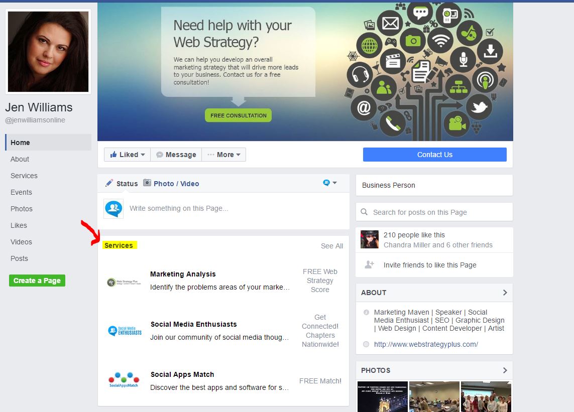
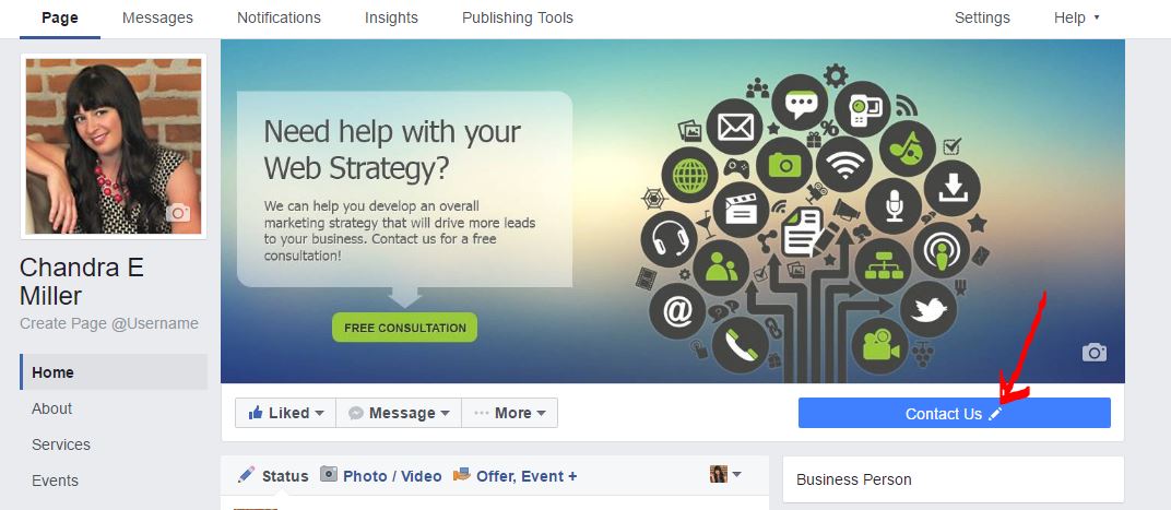
The first change is Facebook is reducing the width of the header image. Instead of stretching across the entire top, the new design reduces the width of this element to 3/4 of the page. The second change has to do with Facebook shops and services sections. If you have either enabled, they will now be prominently displayed on your page above all the status updates.

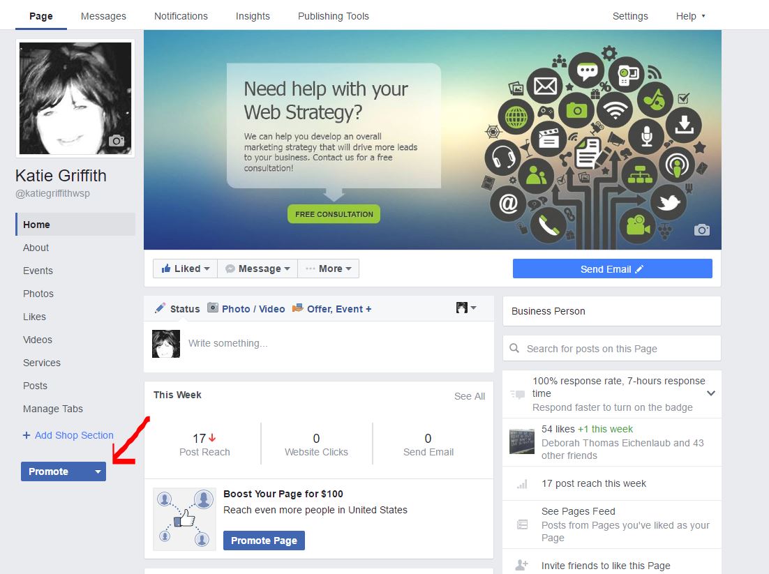
The third change applies to when you’re logged into Facebook and viewing your own page. When you’re looking for the promote button, it will now be in the left sidebar at the bottom instead of its previous position at top right of the cover photo. Related to this is statistics have been moved from that top right spot to below the status update box.

What You Can Do to Optimize Your Updated Business Page
Even though it always take a little time to adjust to a new design change like this, the good news is Facebook didn’t make any massive changes. In fact, most people agree that the new design changes look quite nice. Additionally, moving the shops and services sections higher up on the page should encourage more visitors to check out what businesses have to offer.
With that being said, this is still a change, which is why we want to cover a few ways to make the most of it. Previously, header images had multiple elements overlapping and covering them. The new design gives this image a dedicated space, which is why you should consider making it even more detailed than before. The recommended size for this image is 828 pixels wide and 360 pixels tall, which Facebook will then resize based on device and screen size.
Since the new design has a dedicated space for a call to action button, make sure you add one if you haven’t already. Otherwise, there will be a blank space in the upper portion of your page and you’ll miss out on the opportunity to drive targeted clicks. The same goes for filling out the information on the various tabs. These links are now more visible, so you don’t want someone to click and then not see anything interesting. You can go a step further by adding custom tabs as well.

If you want to make your Facebook page and other social media profiles look their absolute best, be sure to take a look at our social media design services.
Ready to get started? Schedule a Free Initial Consultation


